
The Metropolitan Transportation Authority (MTA) on Wednesday unveiled a reimagined subway map, its first new design since 1979.
The new map used a readable, bright, bold and orderly design, MTA officials said through a press release.
“The new MTA is focused on a quality, 21st century customer experience, and its about time our map caught up,” said MTA Chair and Chief Executive Officer Janno Lieber. “The new version is much easier to read while also reflecting all the enhancements we’ve made over the years.”
The new map was designed by the MTA’s Creative Services Mapping Department and utilizes a diagrammatic style, employing bold, straight lines making it much easier for the eye to follow and more suitable for digital users. The white background, bold colors, horizontal writing and use of black dots make the map more ADA-friendly and easier for persons with visual limitations and cognitive disabilities to read.
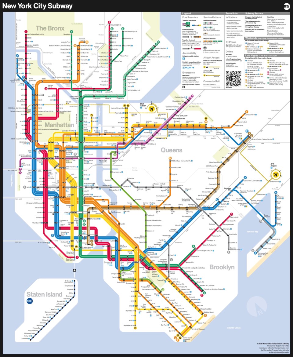
Designers also focused on text legibility, keeping text on one line wherever possible and making better use of open space to alleviate crowding and using a black subway bullet with a white character to provide maximum contrast for easier reading.
The legend on the map is now more detailed and includes accessibility, transfer, and safety information, as well as a QR code that leads users to the MTA website.
Replacing physical maps in the remaining subway cars will be done in phases over the coming weeks. Both the redesigned map and older versions will be available for download on the MTA website.
In addition, subway riders will also see a software redesign of digital subway station screens that increase the frequency of real-time data, updating every five seconds, to better match countdown clocks to real-time train arrivals, officials said.


