In celebration of its 200th anniversary, the Brooklyn Museum on Monday unveiled a refreshed brand and visual identity, marking a significant step in its evolution.
The updated logo and design aim to honor the museum’s rich history while embracing a modern, bold look for the future, according to a press release.
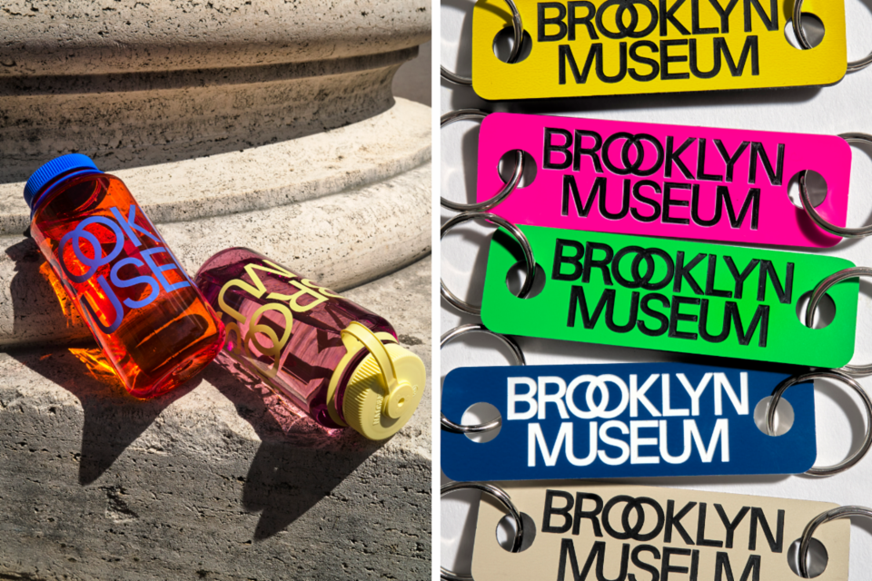
This rebrand will be rolled out over the fall season, with a new website, digital campaign and exclusive merchandise among the updates.
“We needed a new brand that meets the demands of the day, honors our rich history, and brings a whole lot of energy. And there’s no better time to launch it than our 200th anniversary!” said Anne Pasternak, Shelby White and Leon Levy Director of the Brooklyn Museum.
The new logo draws on the museum’s iconic building, whose architecture has evolved from a neoclassical design by McKim, Mead & White to modernist updates in the 1930s and recent renovations that created more welcoming spaces. The design reflects the museum’s past while aligning with its contemporary identity as a hub for diverse communities and ideas.
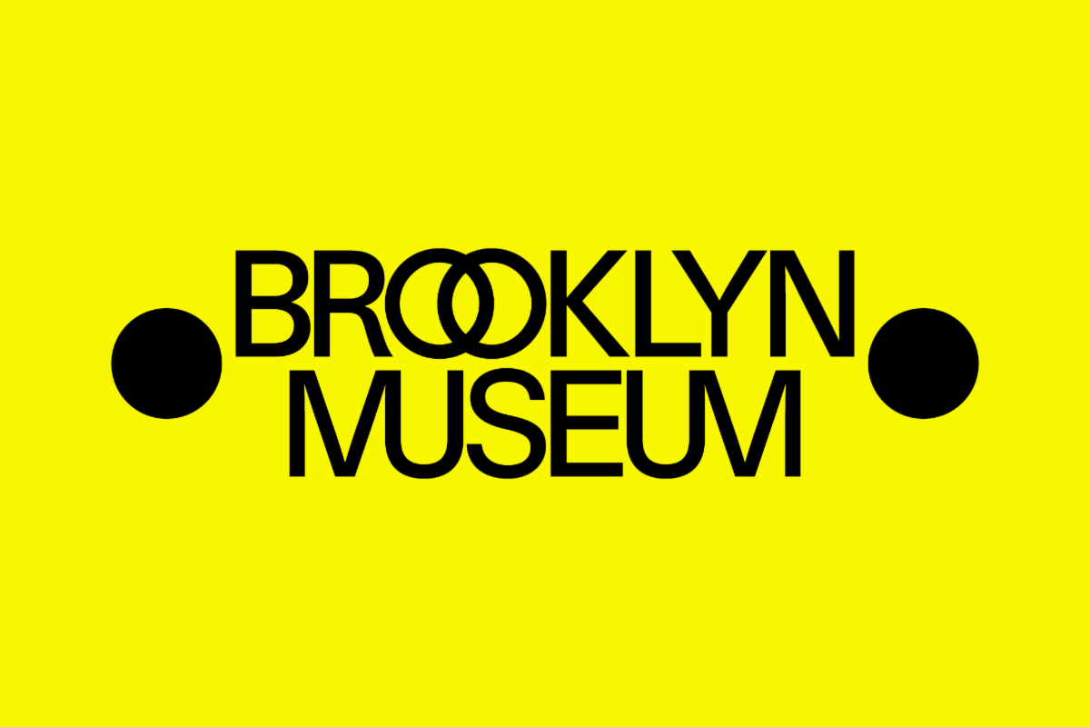
At the heart of the rebrand is a modern sans serif typeface and a distinct use of ligatures, emphasizing the museum’s multi-dimensionality. The logo features two dots, inspired by those framing the names of ancient philosophers and writers on the museum’s facade. These dots reference the museum’s origins as a library and its ongoing role as a space where art and intellectual exploration intersect, the press release said.
The two dots appear throughout various applications, including signs, digital materials and motion graphics, often replacing symbols or illustrations. The logo also intertwines letters, symbolizing unity and continuity in the museum's identity.
The color palette includes shades of gray, paying homage to the museum’s limestone exterior, paired with bright, saturated hues that reflect the dynamic energy of Brooklyn. These design elements highlight the museum as a space where diverse ideas and cultures converge.
The rebrand was developed by Brooklyn-based design studio Other Means, in collaboration with the museum’s in-house team, following a year of research and stakeholder engagement.


